iDEA
In early 2025 I was taken on by iDEA, a unique interior design company based in Shropshire, to do work experience where I learnt more about their approach to graphic design and branding and was given the chance to try create an illustrative languages that would elevate their existing branding elements into something more approachable and human.
iDEA’s Values
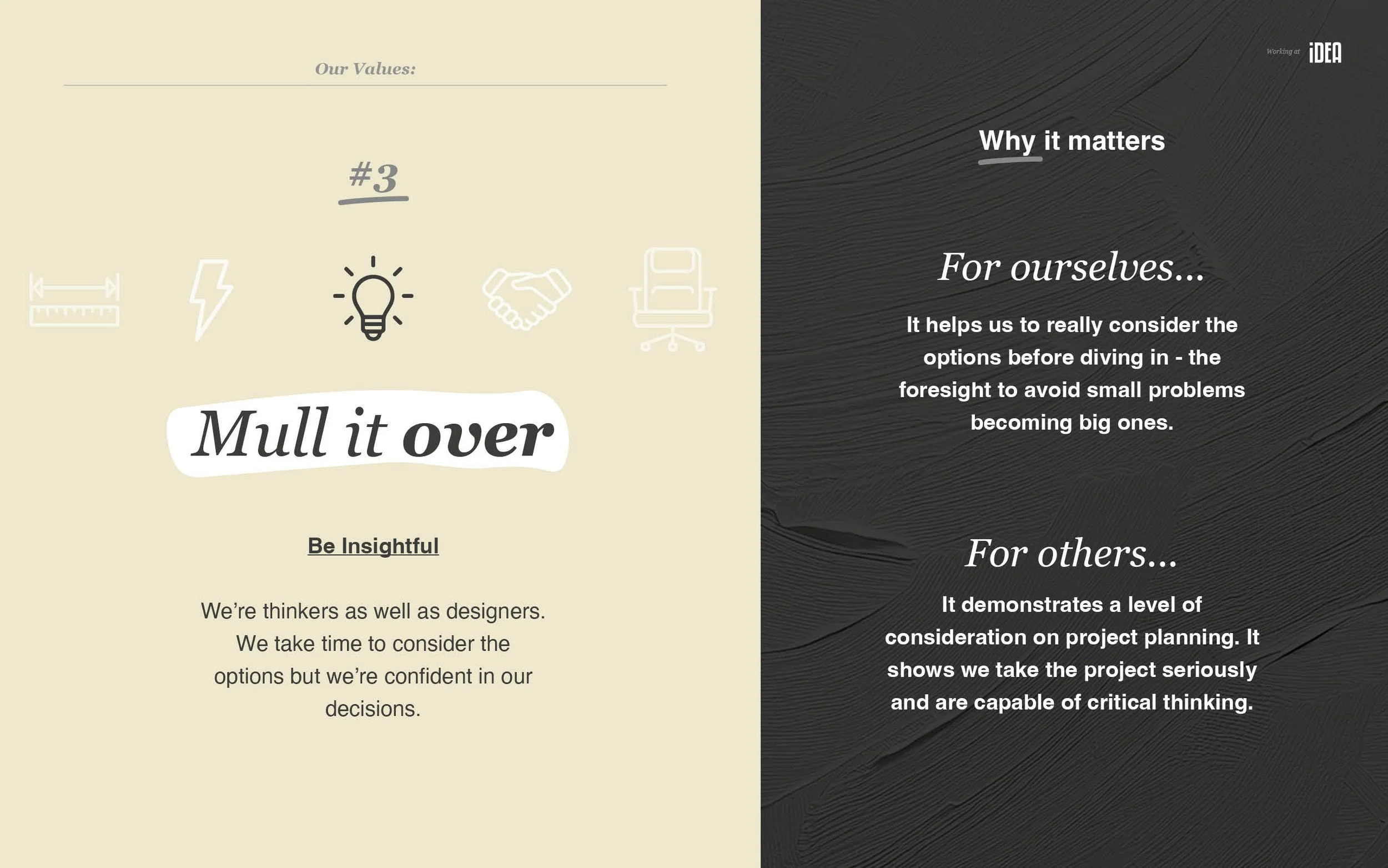
A key part of iDEA’s personal branding is wanting to come across as both professional and human- Robin would describe this as ‘perfectly imperfect. So far they had communicated their humanness with painted texture backgrounds and hand drawn looking highlighted elements, but they wanted to push this further by introducing an illustrative language that would work alongside what they already had.
The end result was an illustrative language where hand drawn lines, shading, and a pencil texture help to communicate more human elements of themselves- and a refined/considered use of colour, and tone, helps to keep everything grounded and digestible.


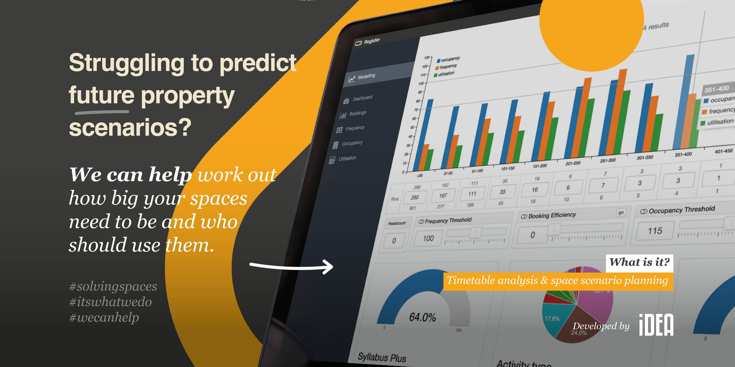
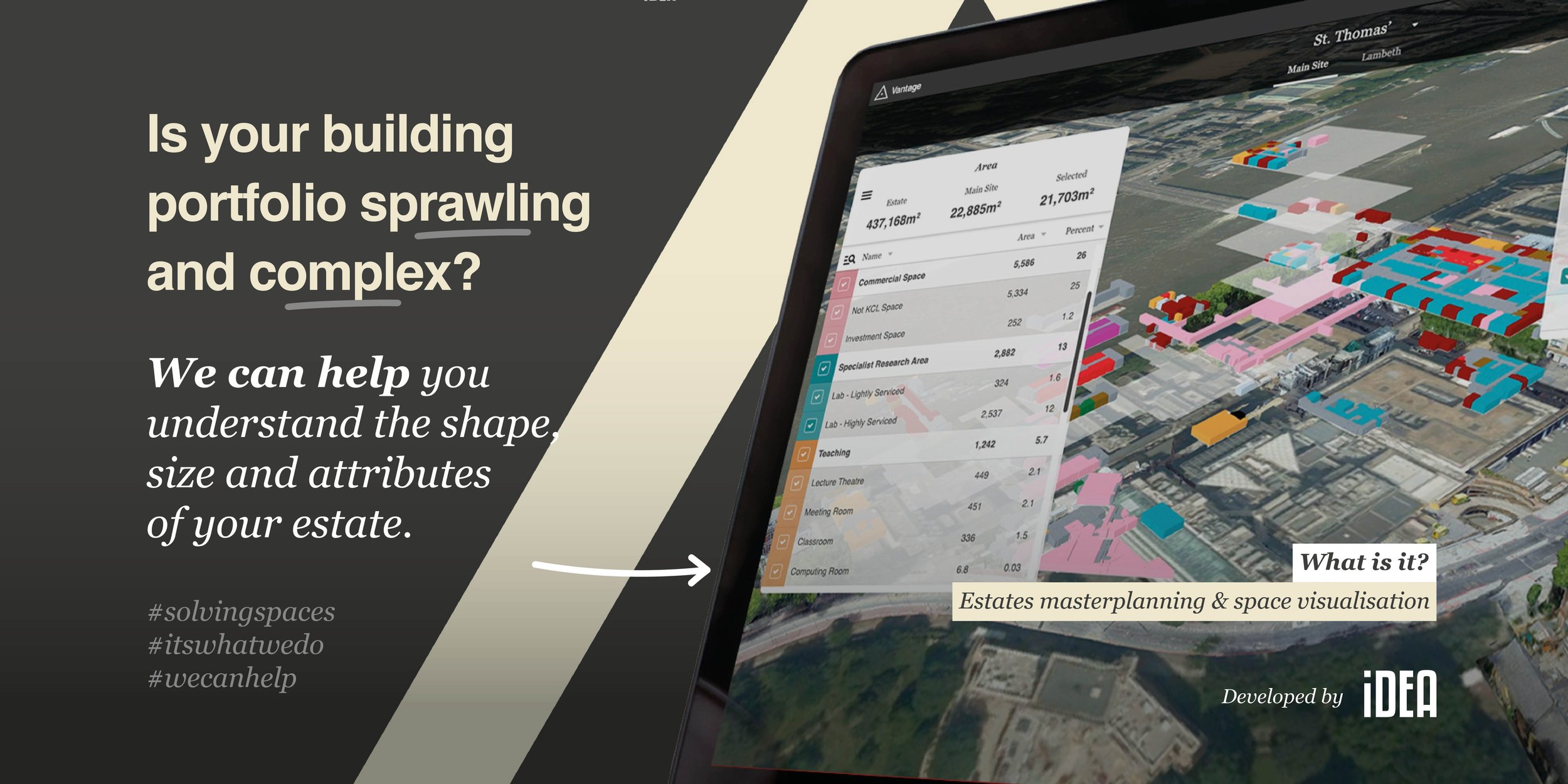
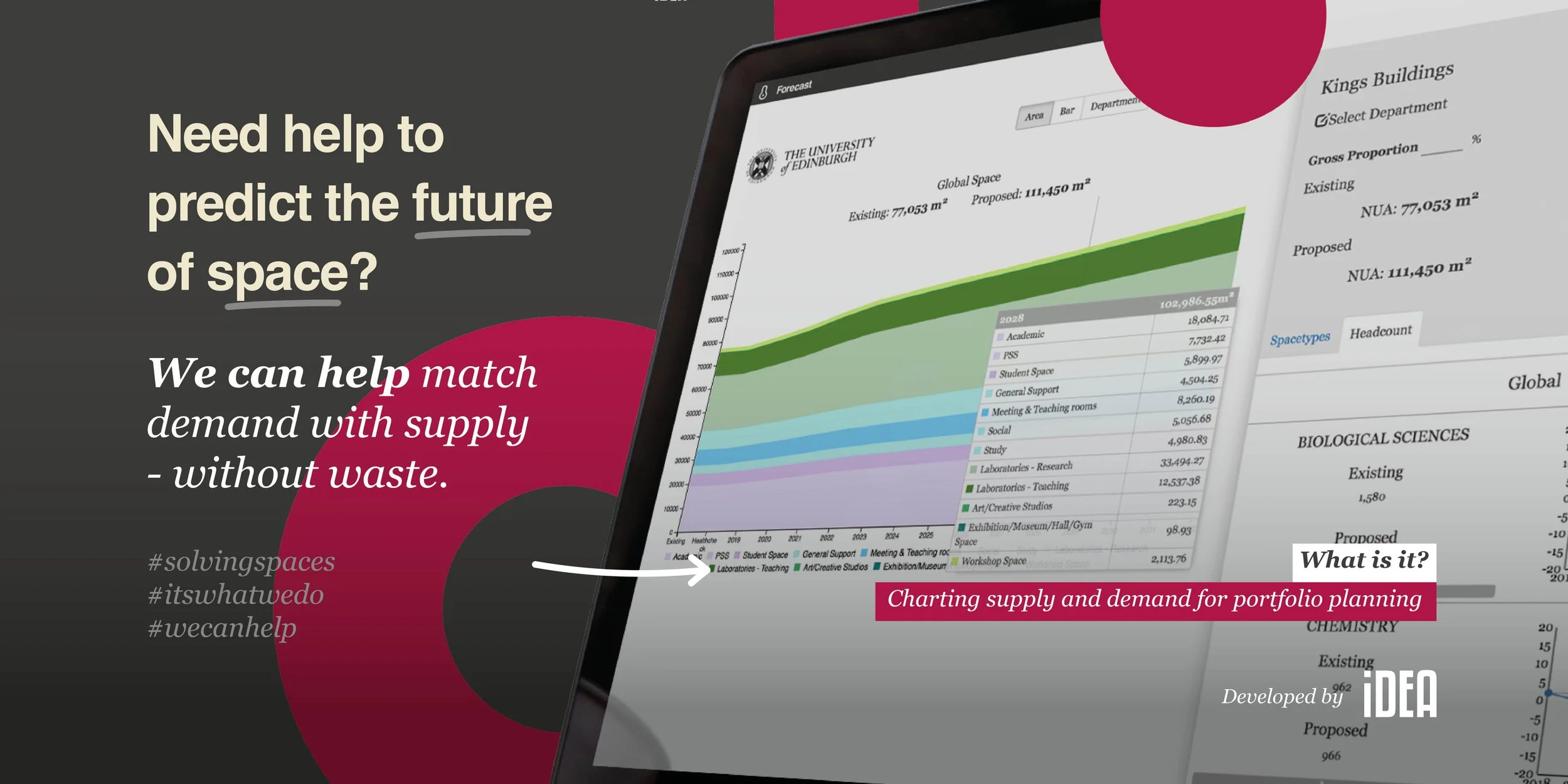
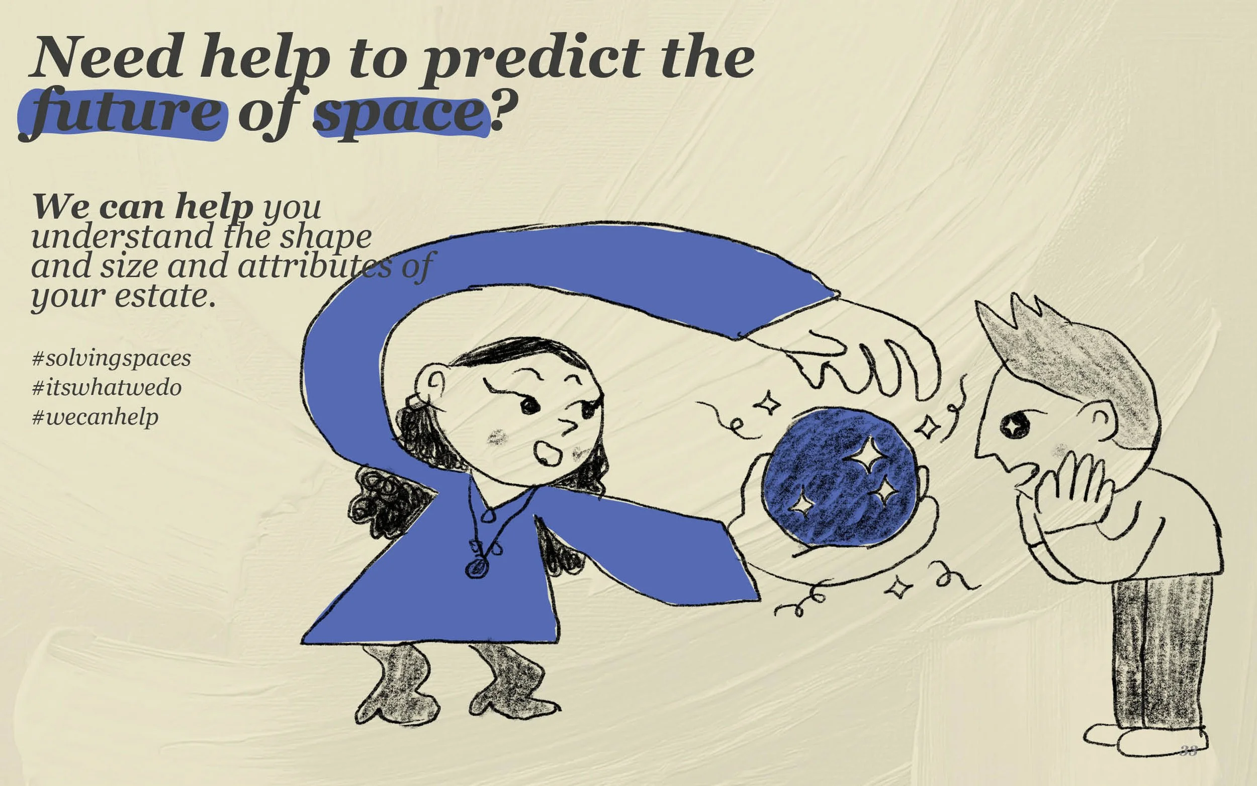
iDEA’s App Advertising
iDEA has a variety of apps they’ve created to aid them with designing, communicating information, and analysing information for projects. Here we tested how the iDEAS’s Values illustration language could be applied to the apps to give them a more approachable feel to more closely fit their desire to be viewed as approachable and friendly.
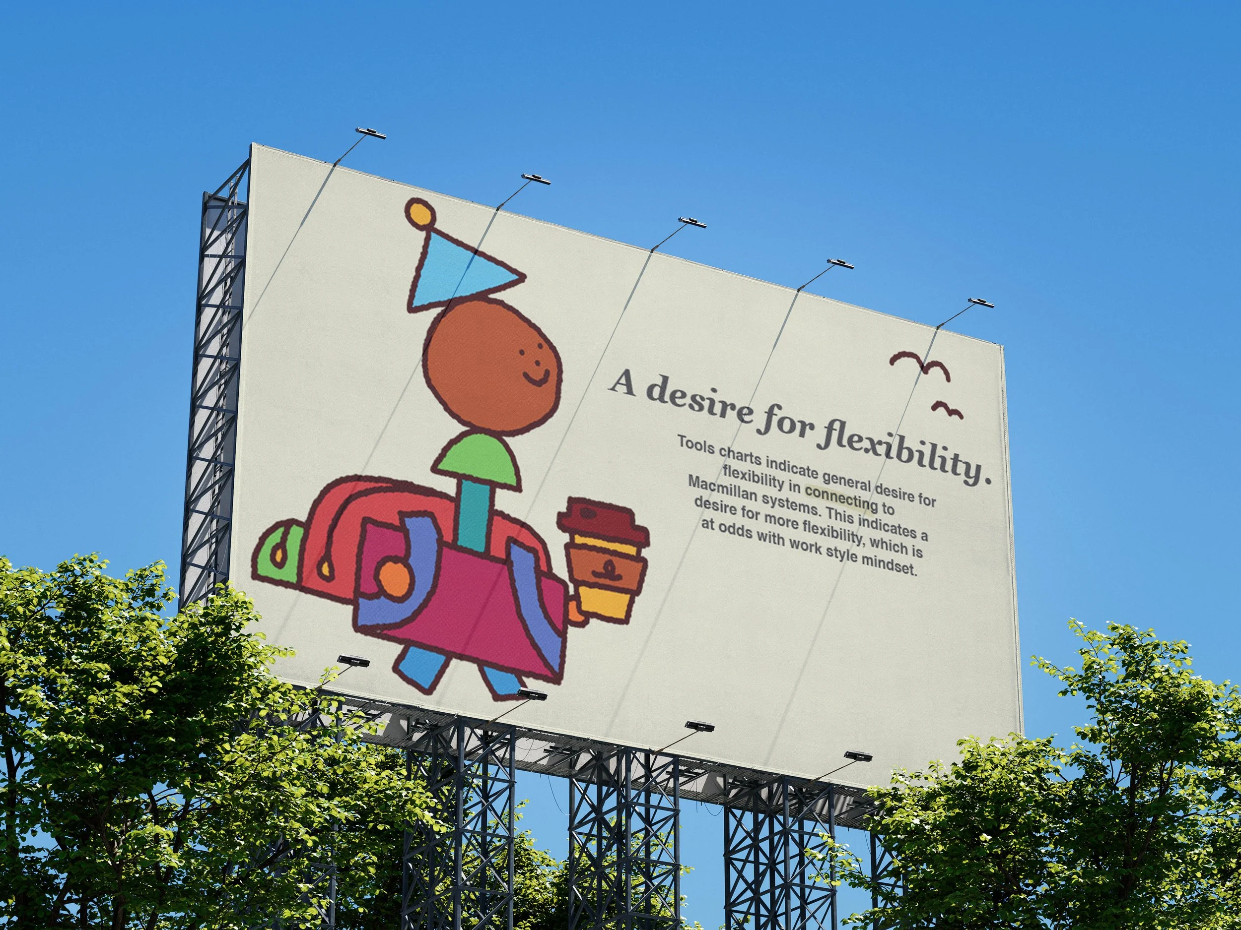
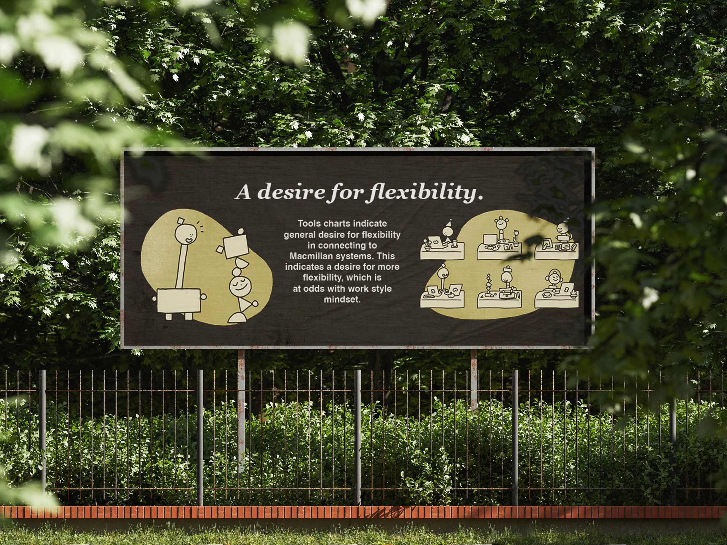
Me + My Workspace
I was tasked with creating an illustrative language, for iDEA’s workplace surveys, that would stand out from other corporate workplace surveys, but still be credible enough to stand with the data collected from the survey.
The design language also needed to be scalable enough to be used across a myriad of different digital and printed communications, plus being adapted to various scenarios (illustrated hot desking anyone?).
The result was this characterful modular block approach, which took inspiration from wooden block toys, and received a big thumbs up from everyone in the office.
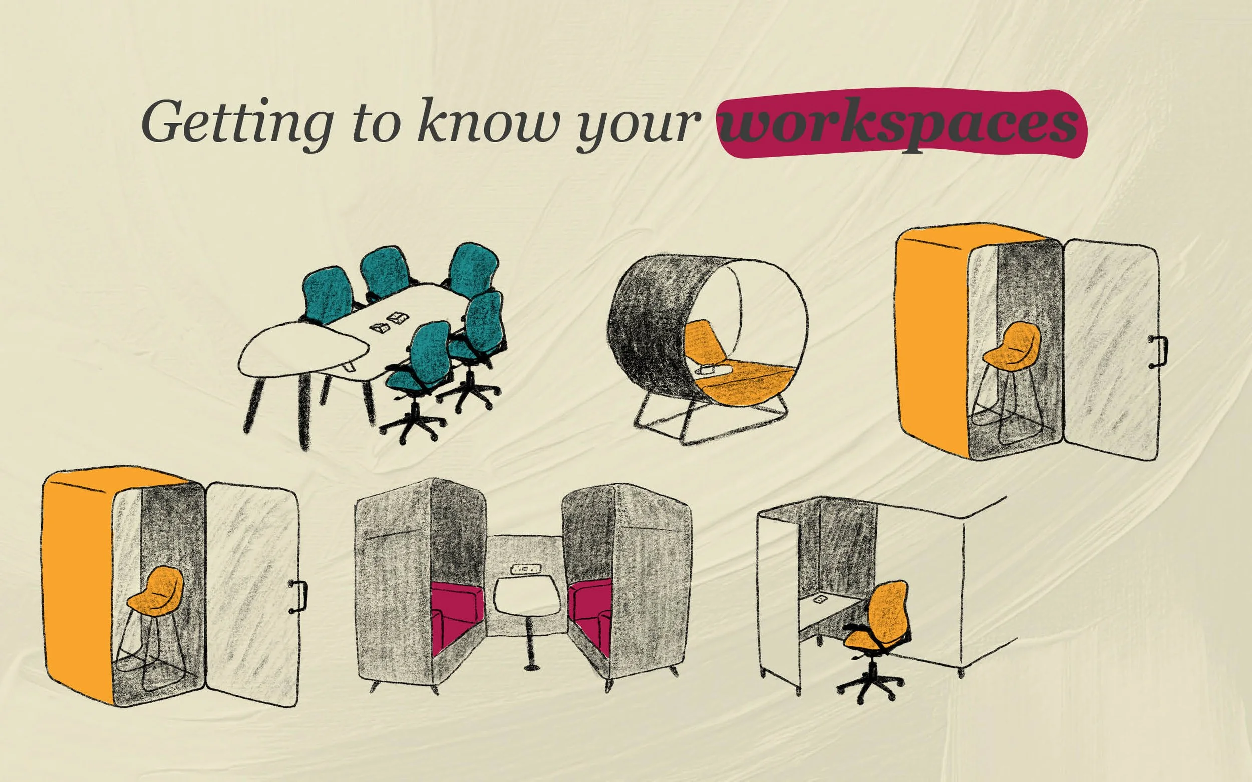
Introducing Clients to their new workspaces
When introducing Clients to their new workspaces iDEA sends over a document detailing how the new furniture lends itself to different work styles. The aim of this project was the find a more appealing/friendly way of presenting the same information, whilst also maintaining professionalism.
This was achieved using simple textured drawings and utilising colour coding of workspace types that was preexisting within the introduction documents.